The Importance of Brand Consistency in Graphic Design

The Importance of Brand Consistency in Graphic Design
In today’s hyper-competitive digital landscape, building a recognizable brand is no longer optional—it’s essential. Yet branding is much more than a striking logo or catchy tagline. It’s about delivering a consistent experience across every interaction your audience has with your business. This is where graphic design plays a pivotal role.
Graphic design is the visual language of your brand. From social media posts and website layouts to product packaging and email campaigns, it shapes how customers perceive and remember you. When executed with consistency, graphic design becomes a powerful tool for building trust, enhancing recall, and setting your brand apart.
This guide breaks down the importance of brand consistency in graphic design, why it matters for business success, and how you can ensure your branding remains cohesive across all touchpoints.
What Is Brand Consistency?
Brand consistency refers to the alignment and uniformity of all brand elements—visual, verbal, and experiential. It ensures that your brand communicates a unified identity no matter where or how it appears.
In graphic design, this means:
- Using the same logo across all platforms.
- Applying a consistent color palette and typography.
- Maintaining a uniform visual style in imagery, icons, and layouts.
- Reflecting your brand’s tone and messaging in all design assets.
In essence, brand consistency ensures that your brand “looks” and “feels” the same—whether a customer sees you on Instagram, opens your app, or walks into your store.
Why Is Brand Consistency Important?
Let’s explore why maintaining consistent design is more than just an aesthetic decision—it’s a growth strategy.
1. Builds Brand Recognition
When your design elements are consistent, customers can instantly recognize your brand. Repetition of visual cues such as colors, fonts, and logo placements reinforces your identity in their minds.
Example:
Coca-Cola’s red-and-white branding is universally recognized. Even without seeing the logo, their signature red evokes strong brand associations.
2. Establishes Credibility and Trust
Inconsistent branding can confuse or alienate your audience. A cohesive, professional look, on the other hand, builds trust.
Customers associate visual consistency with attention to detail, stability, and professionalism—all crucial for fostering loyalty.
3. Enhances Brand Recall
Consistent graphic design reinforces memory. When customers repeatedly see the same brand colors, typography, and messaging, they’re more likely to remember and recognize your brand in the future.
A Lucidpress study found that consistent branding across all platforms can increase revenue by up to 23%.
4. Strengthens Emotional Connections
Visuals evoke emotions. When your design consistently reflects your brand’s personality and values, it creates deeper, emotional ties with your audience.
Example:
Airbnb uses soft colors, warm imagery, and human-centric design to emphasize its mission of belonging and hospitality.
5. Supports Marketing and Communication
Consistency streamlines marketing efforts. It ensures your message resonates clearly, reduces friction, and helps customers move through the buyer journey with confidence.
Key Elements of Brand Consistency in Graphic Design
To achieve brand consistency, start by aligning these core design elements:
1. Logo
Your logo is the cornerstone of your brand identity. It should be:
- Used consistently in terms of size, color, and placement.
- Stored in vector formats (SVG, EPS) for scalability.
- Given enough clear space to ensure it’s not crowded by other elements.
🧠 Pro Tip: Use monochrome versions when necessary but keep the proportions and integrity intact.
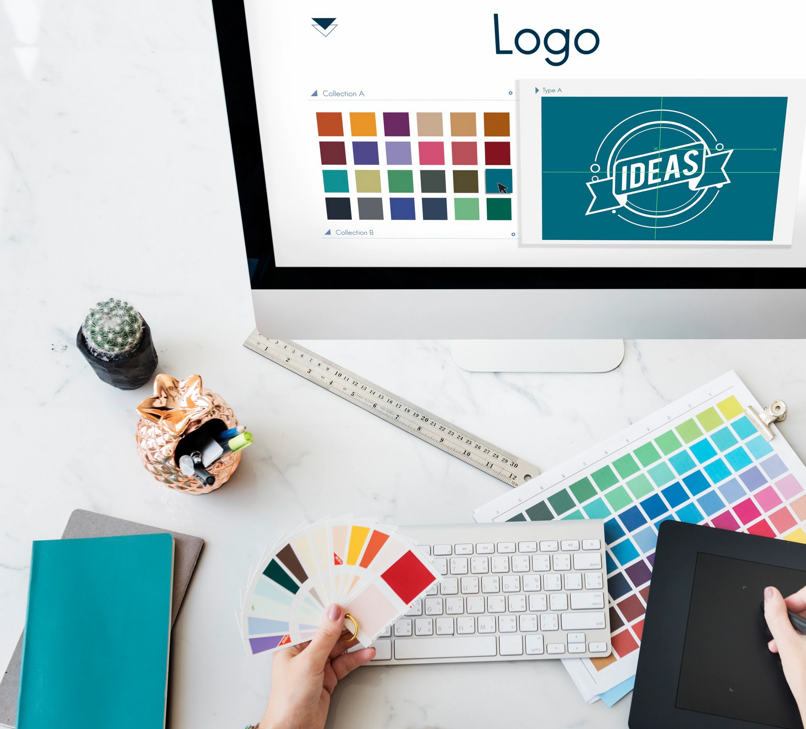
2. Color Palette
Colors carry meaning and emotion. A defined color palette keeps your brand visually cohesive and helps convey your brand’s mood or tone.
Examples:
- Blue = Trust, stability (LinkedIn, IBM)
- Red = Energy, passion (Netflix, Coca-Cola)
- Green = Growth, freshness (Spotify, Whole Foods)
Use consistent HEX, RGB, and CMYK codes across all media.
3. Typography
Typography can express your brand’s tone—whether serious, friendly, modern, or playful.
Best practices:
- Stick to 2–3 fonts (e.g., header, subheader, body).
- Ensure legibility across devices.
- Choose fonts that align with your brand voice (e.g., serif for tradition, sans-serif for modernism).
4. Imagery and Illustrations
Photos, illustrations, and icons should follow a defined style—whether realistic, abstract, minimalist, or vintage.
Example:
Slack uses flat illustrations and playful icons that reflect collaboration and approachability.
🧠 Pro Tip: Curate an image bank that reflects your aesthetic and values.
5. Design Templates
Templates standardize your content and save time.
Create templates for:
- Social media graphics
- Email headers
- Blog images
- Slide decks
- Print materials
🧠 Tools like Canva Pro or Adobe Express allow teams to use branded templates collaboratively.
6. Tone and Messaging
Graphic design should align with your brand’s tone of voice. If your messaging is witty and conversational, your visuals should feel light and friendly. If you’re high-end and formal, designs should reflect elegance and sophistication.
How to Maintain Brand Consistency in Graphic Design
1. Develop a Brand Style Guide
A brand style guide is your visual rulebook.
Include:
- Logo specifications and usage
- Color codes (HEX, RGB, CMYK)
- Font styles and usage rules
- Image guidelines (filters, orientation, subjects)
- Dos and don’ts
🧠 Bonus Tip: Add examples of correct and incorrect usage.
2. Centralize Design Assets
Keep your assets in one accessible location—Google Drive, Dropbox, or dedicated tools like:
- Canva Brand Kit
- Adobe Creative Cloud Libraries
- Frontify
This ensures designers, marketers, and collaborators use the right files every time.
3. Train Your Team
Brand consistency is a team sport. Educate everyone—from marketing to product to support—on the importance of design consistency.
Offer onboarding sessions, share style guides, and conduct regular reviews.
4. Audit Regularly
Review your digital and print materials to ensure alignment. Check:
- Website graphics
- Social posts
- Email templates
- Ad creatives
- Presentation decks
🧠 Tip: Use tools like Trello or Notion to track and assign audit tasks.
5. Collaborate with Skilled Designers
Experienced designers can elevate your brand with professionalism and attention to detail. Whether in-house or freelance, choose designers who understand your brand ethos and can interpret your guidelines effectively.
Common Challenges (and How to Overcome Them)
1. Multiple Designers or Agencies
Solution:
Provide all contributors access to your brand style guide and a shared asset library.
2. Expanding to New Platforms
Solution:
Adapt your designs to fit the new platform’s requirements while maintaining visual consistency.
3. Evolving Brand Identity
Solution:
If you’re rebranding, roll out updates across all platforms simultaneously to avoid mixed messaging.
Real-World Examples of Brand Consistency
✅ Apple
Apple’s clean, minimalist aesthetic is applied consistently—from packaging and product pages to physical stores. It reflects simplicity and innovation.
✅ Nike
Nike’s “Swoosh” logo and “Just Do It” tagline are used consistently in visuals, messaging, and campaigns—resulting in one of the world’s most iconic brands.
✅ McDonald’s
From the golden arches to their red-and-yellow packaging, McDonald’s keeps its design instantly recognizable in every country.
Tools to Help You Stay Consistent
- Canva Pro: Create templates and build a brand kit for easy access.
- Adobe Creative Cloud: Professional design software with collaborative asset libraries.
- Frontify: Manage brand guidelines, digital assets, and collaboration.
- Trello: Organize tasks, campaigns, and brand audits in one place.
Conclusion
Brand consistency in graphic design isn’t just about aesthetics—it’s about building credibility, recognition, and trust. In a world overflowing with content, a cohesive brand presence helps you rise above the noise.
By defining clear design standards, centralizing your assets, training your team, and staying vigilant with audits, you ensure that every touchpoint strengthens your brand identity. Remember: great brands aren’t just seen—they’re remembered.