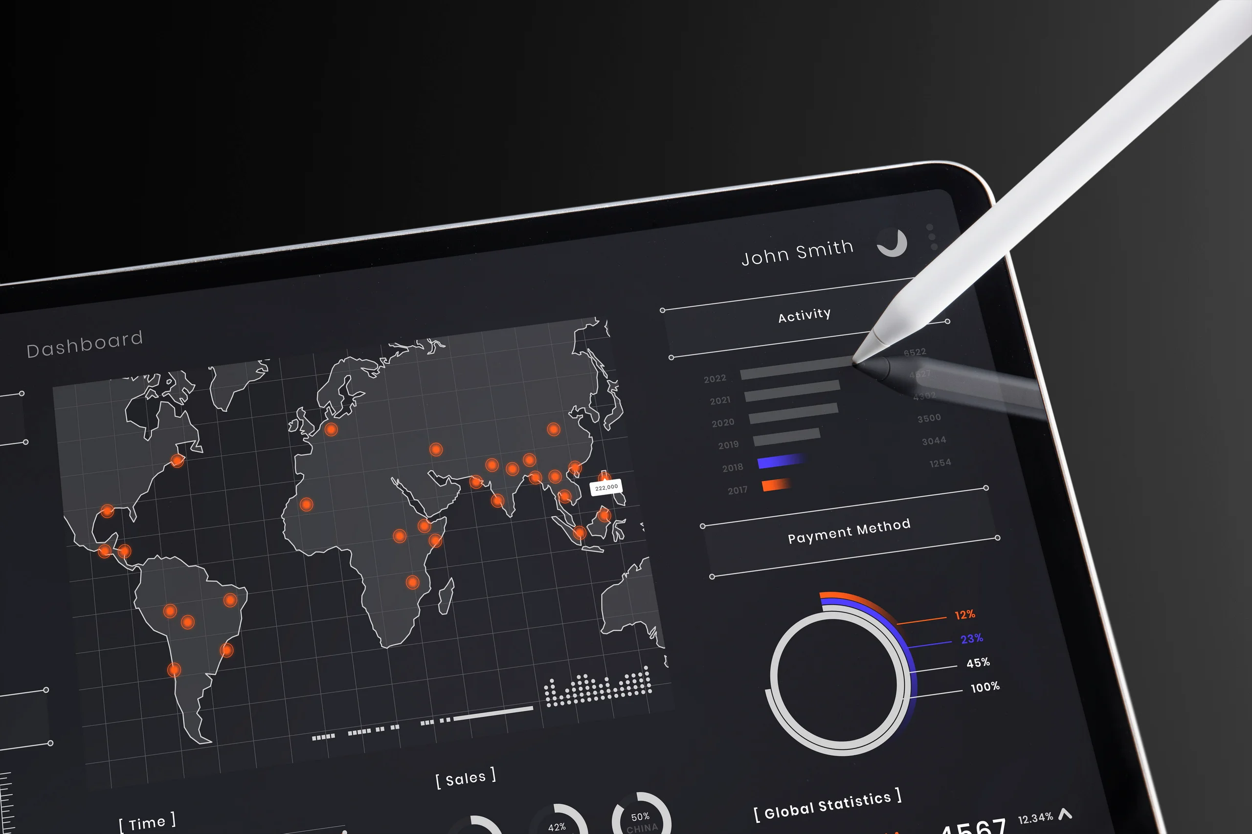
Dark Mode UI: Best Practices for Design and Implementation

Dark Mode UI: Best Practices for Design and Implementation
In 2025, “dark mode” isn’t just a trend, it’s a user expectation.
From smartphones to SaaS dashboards, users now instinctively reach for the little moon icon that dims their screen and soothes their eyes. But what started as a simple aesthetic choice has become a core component of modern user experience (UX), one that blends visual psychology, energy efficiency, and brand strategy.
At KodersKube, we’ve designed hundreds of digital products that look stunning and perform flawlessly in both light and dark interfaces. This is more than color inversion, it’s a science of contrast, readability, and emotion.
Let’s explore what makes dark mode UI effective, where it fails, and how your brand can implement it the right way.
1. The Psychology Behind Dark Mode
Human eyes are drawn to contrast. Dark mode reduces glare and focuses attention, creating a sense of calm and immersion.
But there’s more beneath the surface:
- Low-light comfort: Easier on the eyes in dim environments.
- Cognitive focus: Less visual noise = deeper engagement.
- Emotional tone: Dark interfaces convey sophistication, mystery, and modernity.
According to UX research by Nielsen Norman Group, users perceive dark mode as “premium” and “tech-forward” — making it ideal for digital agencies, fintech, and creative brands.
Dark mode doesn’t just look better. It feels better.
2. The Rise of the Dark Interface Trend
When Apple introduced system-wide dark mode in macOS Mojave and iOS 13, adoption skyrocketed.
By 2025, over 82% of users toggle dark mode at least once a day and apps that don’t support it are increasingly seen as outdated.
From Netflix to Notion, modern interfaces embrace dark palettes not just for comfort, but for brand differentiation.
At KodersKube, we’ve seen that when dark mode is done right, it can even improve perceived performance because smooth visuals + low glare = faster user satisfaction.
3. Core Principles of Great Dark Mode Design
Designing for dark mode isn’t as simple as flipping a color switch. It requires deliberate decisions around contrast, depth, and light hierarchy.
Here are the six principles that guide every KodersKube dark mode project:
1️⃣ Use True Neutrals Carefully
Avoid pure black (#000000), it’s harsh and unnatural. Instead, use off-black or dark gray tones like #121212 or #1E1E1E for depth and comfort.
2️⃣ Maintain Readable Contrast
Follow WCAG standards: maintain at least a 4.5:1 contrast ratio between text and background.
Soft whites (#E0E0E0) or light grays work better than bright white text.
3️⃣ Accents Should Glow, Not Blind
Use brand colors sparingly for highlights, e.g., subtle neon blues or warm reds to create visual hierarchy without overpowering.
4️⃣ Use Shadows and Depth
Dark interfaces can feel flat. Add soft shadows, gradients, and elevation to separate layers and elements.
5️⃣ Preserve Brand Identity
Your logo and brand colors should still feel “you.” Adjust saturation or brightness to ensure consistency across modes.
6️⃣ Test in Real Environments
Always test dark mode designs on multiple screens, mobile, desktop, OLED, and LCD since color rendering varies dramatically.
A dark mode that looks elegant on your monitor may look muddy on an AMOLED phone. Test everything.
4. Common Mistakes in Dark Mode Design
Even top-tier apps make design missteps. Here are pitfalls to avoid:
❌ Overusing pure black: Creates harsh contrast and eye fatigue.
❌ Ignoring accessibility: Poor color contrast can alienate low-vision users.
❌ Color bleeding: Bright accents look oversaturated against dark backgrounds.
❌ Neglecting imagery: Photos or icons with transparent backgrounds can vanish.
❌ Static design systems: Not adapting typography or icon weights between modes.
At KodersKube, we build adaptive design tokens that dynamically adjust contrast, tone, and hierarchy between light and dark modes ensuring usability and beauty coexist.
5. Technical Implementation: CSS to Frameworks
Implementing dark mode isn’t complex but it requires strategy.
Option 1: CSS Variables
Use custom properties to define color palettes:
:root {
  --bg-color: #ffffff;
  --text-color: #111111;
}

[data-theme='dark'] {
  --bg-color: #121212;
  --text-color: #e0e0e0;
}
Then toggle with a simple JavaScript function or system preference:
if (window.matchMedia('(prefers-color-scheme: dark)').matches) {
  document.documentElement.setAttribute('data-theme', 'dark');
}
Option 2: Framework-Level Solutions
If you’re building with:
- React / Next.js: Use styled-components or Tailwind’s
dark:variants. - Vue / Nuxt: Integrate CSS variables with Vuex state toggling.
- Flutter / Swift: Apply theme providers that support real-time toggling.
KodersKube often pairs dark mode with localStorage or OS-level detection, ensuring seamless transitions across sessions.
6. Performance Considerations
Dark mode can also subtly improve energy efficiency, especially on OLED screens.
Because black pixels are “off,” power usage decreases improving battery life by up to 30% on mobile devices.
Additionally, fewer bright pixels mean lower GPU strain leading to smoother scrolling and animation performance.
However, always compress background images and test transitions to avoid re-render flicker between modes.
7. UX & Branding Synergy
Dark mode isn’t just about looks, it’s about tone.
Consider how your color palette communicates emotion:
- Blue hues: Calm, reliable, techy
- Purple: Creative, premium, innovative
- Orange/Red: Energetic, bold, confident
When transitioning to dark mode, keep your emotional brand DNA intact.
At KodersKube, we often tweak saturation or hue slightly to make sure brand identity shines — even in the dark.
Light mode sells clarity.
Dark mode sells confidence.
🌖 8. Accessibility and Inclusivity
Accessibility isn’t optional anymore, it’s UX 101.
To make your dark mode inclusive:
- Follow WCAG contrast ratios (minimum 4.5:1 for text).
- Use accessible toggles with ARIA labels.
- Ensure color isn’t the only way to convey information (e.g., include icons or text indicators).
We also test for color blindness, ensuring dark interfaces remain readable in all conditions.
Because the best design isn’t just beautiful, it’s fair.
9. The Future of Dark Mode
Dark mode is evolving fast beyond color themes into contextual design.
Coming trends include:
- Auto Ambient Themes: Adapting UI tone to time of day or environment.
- AI-driven Personalization: Systems that adjust color temperature dynamically for mood or focus.
- Hybrid Interfaces: Soft gradients that merge dark and light regions for visual depth.
At KodersKube, we’re experimenting with adaptive theming engines that let users fine-tune brightness, accent intensity, and even color warmth.
Tomorrow’s dark mode won’t just react, it’ll learn your eyes.
Conclusion
Dark mode isn’t a checkbox, it’s a chance to reimagine your product’s visual identity.
It speaks to users who crave control, comfort, and sophistication.
When designed thoughtfully, it enhances usability, strengthens brand presence, and subtly signals innovation.
At KodersKube, our designers approach dark mode not as inversion but as illumination:
bringing elegance, empathy, and performance into perfect balance.
Because the best dark modes don’t just dim the light, they elevate the experience.