Design Systems for Dynamic, Responsive Brands: Building the Architecture That Scales

Design Systems for Dynamic, Responsive Brands: Building the Architecture That Scales
Your Brand Looks Different Everywhere. And It’s Costing You.
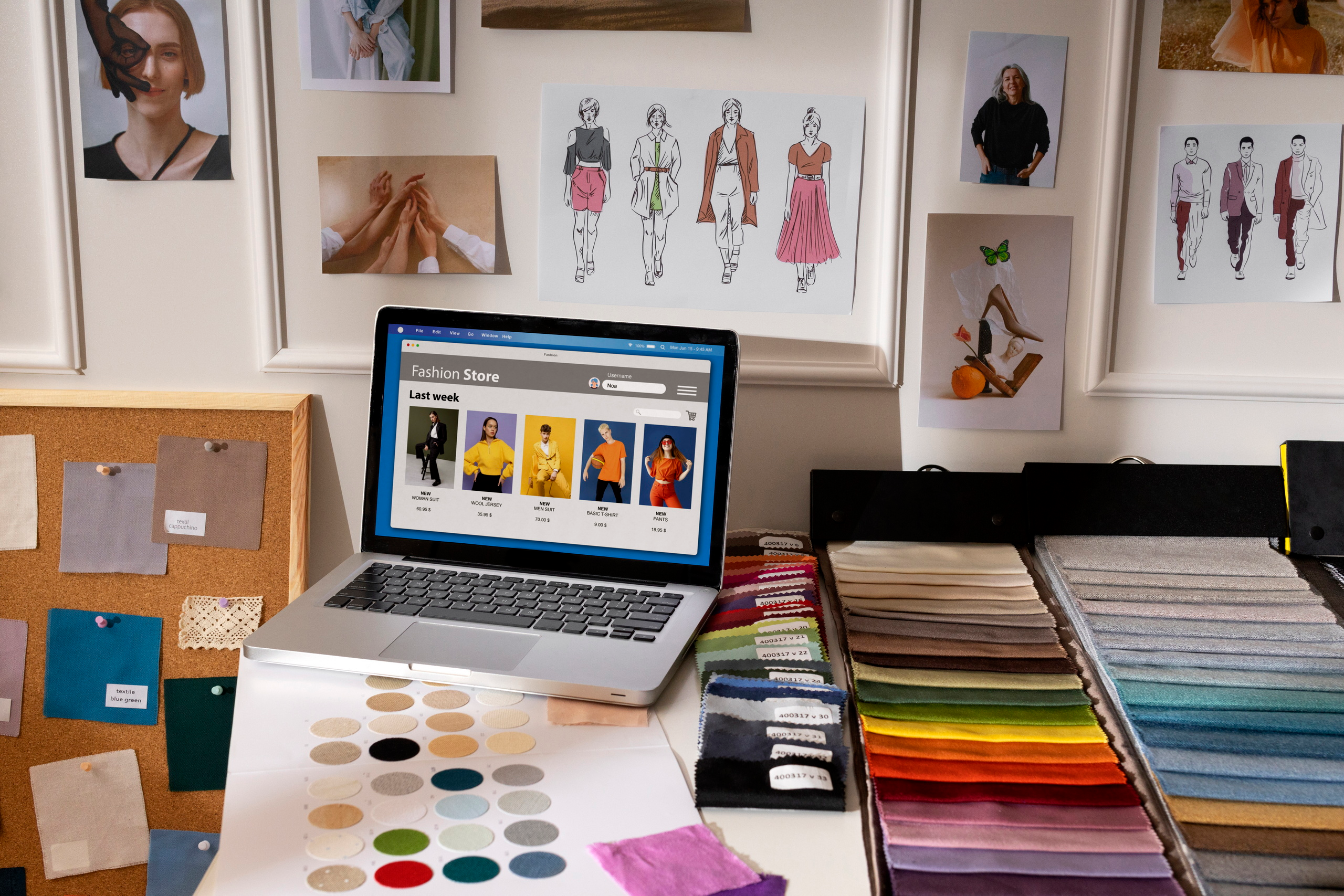
Open your website. Check your app. Look at your email templates. Browse your social media graphics.
If you’re like most companies, they don’t quite match. The blue isn’t the same shade. The typography is inconsistent. The spacing feels off in some places, generous in others. Your brand looks like it was designed by different people—because it was.
This isn’t a small problem. This is a scalability crisis wearing a design hat.
Every time a designer makes a choice about color, spacing, or button style without a guide, they’re making a bet against consistency. Multiply that across ten team members, fifty marketing campaigns, and a hundred product features, and you’ve got a brand that fragments with every decision.
The cost? Eroded brand recognition. Slower product development. Confused customers. Frustrated designers rebuilding the same components over and over.
Here’s what separates the scaling companies from the stalling ones: they’ve built a design system.
Not a design guideline that sits in a Figma file and gets ignored. A real, living system where design decisions compound, teams move faster, and brand consistency becomes inevitable rather than aspirational.
What a Design System Actually Is (Let’s Clear Up the Confusion)
Before we go further, let’s define what we’re building.
A design system is a comprehensive collection of reusable components, patterns, and principles that guide how products are designed and built. It’s not a style guide. It’s not a component library. It’s both of those things, plus the thinking that connects them.
A design system has three core layers:
Layer 1: Principles & Values The “why” behind decisions. “We value clarity over beauty.” “We design for accessibility first.” These guide every decision downstream.
Layer 2: Design Tokens & Guidelines The atomic building blocks. Colors, typography, spacing, iconography. These are defined once, used everywhere.
Layer 3: Components & Patterns Pre-built UI elements (buttons, cards, navigation) and interaction patterns (how forms work, how errors appear). Designers and developers use these instead of recreating them.
Think of it like language. Principles are grammar rules. Design tokens are the alphabet. Components are words. Patterns are sentence structures.
A design system ensures everyone is speaking the same language.
Why Design Systems Matter (The Real Business Case)
This isn’t abstract. Design systems drive measurable business outcomes.
Speed: A designer building a new feature without a system spends 30% of time making micro-decisions (What shade of gray? How much padding? Font size?). A design system eliminates those decisions. Work gets done 40-50% faster.
Consistency: Without a system, brand inconsistency compounds. Each new feature drifts slightly. After 6 months, your product looks like four different apps. A design system makes consistency the path of least resistance.
Scalability: A small team can maintain one product without a system. A growing team scaling to five products? Impossible without a system. You’ll either stop shipping or sacrifice consistency.
Quality: When designers spend time making micro-decisions, they’re not thinking strategically. When those decisions are pre-made, they can focus on real problems: user research, information architecture, accessibility.
Handoff efficiency: A designer hands off to a developer. Without a system, there’s ambiguity. “Is this button 8px or 12px padding?” With a system, it’s documented. Development becomes faster and more accurate.
Onboarding: A new designer joins your team. Without a system, they spend weeks learning the unwritten conventions. With a system, they’re productive in days.
The ROI is staggering. Companies that implement design systems report 40-60% faster design-to-development cycles, 30% reduction in design debt, and measurably higher customer satisfaction.
The Components of a Mature Design System
Let’s break down what goes inside.
1. Design Principles
These are the beliefs that guide every design decision. They’re unique to your brand.
Examples:
- “Clarity first. Never choose beauty over clarity.”
- “Accessibility is non-negotiable. Every component works for every user.”
- “Progressive disclosure. Show what’s necessary, hide complexity until needed.”
- “Consistency over novelty. Familiar patterns beat unique solutions.”
These aren’t theoretical. They’re decision-making filters. When a designer is debating between two button styles, the principles help them choose.
2. Design Tokens
Design tokens are the atomic units. They’re variables that define your visual language.
Color tokens:
- Primary:
#0066FF - Secondary:
#6B5B95 - Success:
#22C55E - Error:
#EF4444 - Neutral 50:
#F9FAFB - Neutral 900:
#111827
Typography tokens:
- Heading 1: 32px, 700 weight, 1.2 line-height
- Heading 2: 24px, 700 weight, 1.3 line-height
- Body: 16px, 400 weight, 1.5 line-height
Spacing tokens:
- XS: 4px
- SM: 8px
- MD: 16px
- LG: 24px
- XL: 32px
Shadows, borders, animations— all tokenized.
The power: Define once, use everywhere. Change primary color? One edit propagates across the entire product.
3. Components
Pre-built, reusable UI elements. Every component should have:
Visual states:
- Default
- Hover
- Active
- Disabled
- Loading
- Error
Documentation:
- What is this component for?
- When do you use it?
- When do you not use it? (This is critical—misuse happens when guidelines are unclear)
- How does it behave on mobile?
- Accessibility considerations
Examples:
Button component:
- Default state: Primary button, secondary button, tertiary button
- Sizes: Small, medium, large
- Widths: Full width, auto width
- With icon, with text, with both
- Disabled state
- Loading state
Form input component:
- Default state
- Focus state
- Filled state
- Error state
- Success state
- Disabled state
- With label, with helper text, with error message
- Different input types: text, email, password, number
Card component:
- Default state
- Hover state
- Interactive state
- With image, without image
- With footer, without footer
- Elevation variations
The goal: A designer should never have to ask “What does a button look like?” It’s in the system.
4. Patterns
Patterns are solutions to recurring design problems. They’re larger than components—they combine multiple components into workflows.
Examples:
- Form patterns: How do multi-step forms work? What’s the validation pattern? How do errors appear?
- Navigation patterns: Sidebar navigation, top navigation, breadcrumbs—when does each apply?
- Empty states: When a list is empty, what do we show?
- Error states: How do we show errors? When do we use modals vs. inline messaging?
- Loading states: Skeleton screens, spinners, progress indicators—when is each appropriate?
Patterns prevent designers from making the same decision 100 times.
5. Documentation
The system only works if people use it. Documentation makes that possible.
Good documentation includes:
- Purpose and principles (why does this exist?)
- When to use it (decision trees help)
- When NOT to use it (equally important)
- Code examples (for developers)
- Accessibility notes
- Mobile behavior
- Real-world examples in actual products
Building Your Design System: The Phased Approach
Don’t try to build the perfect system in isolation. Build it iteratively, in phases.
Phase 1: Audit & Document (Weeks 1-3)
Audit your current design landscape.
- Screenshot every UI in your product
- Document every color currently in use (you’ll find 47 variations of “blue”)
- List every typography style
- Record spacing conventions
- Identify redundant components
This audit is humbling. You’ll discover inconsistencies you didn’t know existed. That’s valuable information.
Output: An audit document. “Currently, we use 12 blue variations, 8 font sizes, and the same button is built 4 different ways.”
Phase 2: Define Core Tokens (Weeks 4-5)
Start small. Define the essential tokens:
- 8-10 core colors (including neutrals)
- 4-5 font sizes for body copy
- 4-5 font sizes for headings
- Spacing scale (4px base: 4, 8, 16, 24, 32, 48, 64)
Don’t overthink it. You’ll refine it later. Just get something codified.
Create a Figma file (or equivalent) with these tokens visualized. Make it beautiful. Make people want to use it.
Phase 3: Build Core Components (Weeks 6-10)
Start with the highest-value components:
- Button (used everywhere)
- Form inputs (used in every form)
- Card (used in every list)
- Navigation (used on every page)
- Modal/Dialog (used everywhere)
Build each component with all its states. Document it. Test it with users if you can.
Don’t build 50 components. Build 5 really well. You’ll expand later.
Phase 4: Integrate Into Workflow (Weeks 11-12)
Make the system part of how people work:
- Update design briefs to reference the system
- Have designers use components from the system by default
- Track “system adoption rate” (% of designs using system components)
- When someone deviates, ask why (sometimes it’s justified, sometimes it reveals gaps)
Phase 5: Expand & Refine (Ongoing)
Add new components based on need. Refine existing ones based on feedback. This is never “done.”
Design Systems for Responsive, Dynamic Brands
Traditional design systems were static. “Here’s the component. Use it exactly like this.”
Modern brands need dynamic systems.
What does dynamic mean?
It means the system adapts to context—light mode and dark mode, mobile and desktop, different languages, different accessibility needs.
Token Variations for Dark/Light Modes
Instead of one set of colors, define tokens for both contexts:
Color token: "primary"
Light mode: #0066FF
Dark mode: #4D94FF (lighter blue for readability)

Color token: "background"
Light mode: #FFFFFF
Dark mode: #0F1419
The component is the same. The tokens change. The system handles both.
Responsive Component Behavior
Components adapt to screen size:
Button component:
- Desktop: Text + icon side-by-side
- Mobile: Icon only (saves space), or full width
Card component:
- Desktop: 3-column grid
- Tablet: 2-column grid
- Mobile: 1-column stack
Documentation specifies these breakpoints.
Accessibility Variants
Different users, different needs:
Button component:
- Standard: Uses color to indicate state
- High contrast: Uses shape + color (color-blind accessible)
- Large text: Bigger font, more padding for easier clicking
The system supports all of them.
Tools for Building Design Systems
You don’t need fancy tools, but some make it easier:
Design tools:
- Figma (best-in-class for collaborative design systems)
- Adobe XD (good alternative)
- Storybook (for component libraries—connects design to code)
Documentation:
- Figma (built-in documentation)
- Zeroheight (specialized design system documentation)
- Notion (free, collaborative)
Code component libraries:
- React Storybook (if building in React)
- Vue Component Library (if building in Vue)
- Web Components (framework-agnostic)
The tools matter less than the discipline. A design system in Notion is better than no system in Figma.
The Designer’s Experience: How a System Accelerates Work
Let’s walk through how a design system changes the day-to-day.
Without a system:
- Designer starts wireframe
- “What color should this button be?” Opens old designs, looks at 6 variations, picks one
- “What spacing around text?” Measures pixels in old design, guesses
- “What font size for labels?” Looks at 3 different options, picks one
- Component is designed. Handed to developer.
- Developer: “Is this 8px or 12px padding?” Back to designer.
- Back and forth for days.
- Finally ships. Looks slightly different than intended.
With a system:
- Designer starts wireframe
- Opens design system Figma file
- Drags in button component (color is already decided)
- Drags in spacing token (4px, 8px, 16px—picks one)
- Applies heading style (font size, weight, line-height all pre-selected)
- Hands to developer with a link to the system
- Developer builds from same system
- Zero ambiguity. Ships fast. Looks perfect.
The time savings compound. After 20 design decisions, the system-based designer has saved 10 hours.
Common Design System Mistakes
Mistake #1: Building in isolation
Team spends 3 months building the perfect system. Launches with fanfare. Designers ignore it because they weren’t involved.
Solution: Build with input from designers and developers from day one. Involve them, get their buy-in.
Mistake #2: Too many options
“Here are 47 button variations for every use case.” Designers get paralyzed.
Solution: Start with 3 button types. Expand only when you find a need that isn’t covered.
Mistake #3: Static documentation
System is documented in a PDF that never gets updated. By month 3, it’s outdated. Designers stop trusting it.
Solution: Keep documentation in a tool that’s easy to update (Figma, Notion). Update it when the system changes. Real-time documentation beats perfect-but-stale documentation.
Mistake #4: No governance
Designers can deviate from the system whenever they feel like it. System quickly becomes irrelevant.
Solution: Have a “system owner” who reviews deviations. Sometimes deviations are justified (and become new system components). Sometimes they’re not (and get redirected). Governance prevents degradation.
Mistake #5: Trying to control everything
System is so rigid, it constrains creativity. Designers resent it.
Solution: System should be opinionated about constraints that matter (brand consistency, accessibility). Be flexible about creativity (how components look, animations, micro-interactions).
Measuring Design System Success
What does success look like?
Design metrics:
- Component reuse rate (% of designs using system components)
- Time to design a feature (should decrease)
- Design deviation rate (% of new design using non-system components)
Development metrics:
- Time to implement a feature (should decrease)
- Bug rate in UI (should decrease as patterns are tested)
- Accessibility issues (should decrease)
Team metrics:
- New designer onboarding time (should decrease)
- Designer satisfaction (more time on strategy, less on minutiae)
- Design-dev collaboration quality
Business metrics:
- Feature velocity (features shipped per sprint)
- User satisfaction with product consistency
- Reduction in design debt
Measure these quarterly. They tell the story of whether the system is working.
From Starter to Mature: The Evolution
A design system evolves:
Month 1-3 (Starter):
- 5-10 core components
- Basic design tokens
- Manual documentation
- Limited adoption
Month 4-6 (Growth):
- 20-30 components
- Refined tokens with dark mode
- Documentation in shared tool
- 60%+ component adoption
Month 7-12 (Scaling):
- 50+ components
- Sophisticated token system
- Automated documentation
- 80%+ component adoption
- Accessibility audit complete
Year 2+ (Mature):
- 100+ components
- AI-powered component suggestions
- Real-time documentation sync
- Platform-specific systems (web, mobile, etc.)
- Governance process institutionalized
Each phase builds on the previous. Don’t try to be mature on day 1.
The Developer’s Experience: Why Engineers Love Design Systems
Developers benefit as much as designers.
Without a system:
- Designer hands off design file
- Engineer: “What’s the exact padding? Font size? Line height?”
- Back and forth for clarification
- Engineer eventually eyeballs it, builds it wrong, designer asks for changes
With a system:
- Designer references component from system
- Engineer uses code component directly from library
- Looks exactly like design. Zero ambiguity. No rework.
A good design system has code implementations. React components. Vue components. Or Web Components (framework-agnostic).
Developers don’t rebuild components. They import them.
This saves engineering time and ensures consistency.
Design Systems and Brand Evolution
A great question: What happens when your brand evolves?
Without a system: Change one element, and it ripples inconsistently across dozens of places. Some get updated, some don’t. Brand looks fragmented.
With a system: Update the token. Everything that uses that token updates automatically.
This is powerful. You can evolve your brand globally with confidence.
Real example: A company wants to shift from blue to purple as primary color. In their design system, they change one token. All buttons, links, interactive elements update. Entire product shifts in minutes.
Without a system, this is a 2-week project affecting 50 different components.
The Hidden Superpower: Handoff and Scale
The ultimate test of a design system: Can you hand off to someone else and have them maintain it?
A design system with:
- Clear documentation
- Well-defined tokens
- Established patterns
- Governance process
…can be maintained and evolved by anyone. That’s scalability.
You can now have distributed design teams across geographies, time zones, companies. They all follow the same system. They all produce consistent work.
What’s Next?
Your design system doesn’t need to be perfect on day one. It needs to start.
Begin with an audit. Look at what you’re building now. Identify the patterns. Codify them. Share them.
Then expand. One component at a time. One improvement at a time.
In 6 months, you’ll have a system that accelerates design and development, ensures consistency, and makes scaling possible.
In 12 months, you’ll wonder how you ever worked without it.
Start this week. Pick five essential components. Document them. Share them. Use them. Then build from there.
That’s how design systems that actually matter get built.